When Amsel Met Sally
Just wanted to share this…
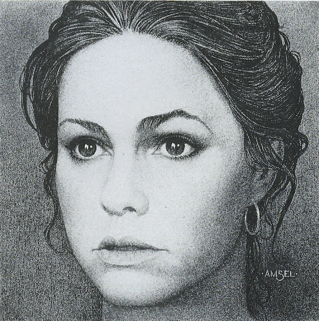
Of all Richard Amsel’s movie posters and magazine covers, this simple but intimate portrait of Sally Field is my all-time favorite. I can’t help staring at it.
It’s like a delicate pointillist masterpiece.
Not only does he perfectly capture her face, but the soul behind it – slightly sad and vulnerable. Her eyes wary, even alarmed, with twin reflections of what looks like a lone flame. That small wounded mouth, with those severe cut-like lines on each side I never really noticed before…but which, along with her chipmunk cheeks, are the most distinctive features of her cherubic beauty. .
She looks so exposed, so naked – with only a couple fallen tendrils of hair to protect her.
But so alive I’m waiting for what she’s about to say.
This is what a simple piece of portraiture can do that a photograph cannot – give a deeper feeling of the subject. Hint at something under the skin. Not so simple, not so pretty.
My guess is he sketched this off a publicity photo of the actress in character as Norma Rae, but he somehow managed to create the definitive image of her in real life as well. It’s “unfinished” – intended to be colored and replicated on thousands of tiny little TV Guide covers in 1979, plastered with an address label and used as a coaster for cocktails by tired people who only want to know if tonight’s “M*A*S*H” is a repeat or not. It was a commercial job I’m sure he knocked out in a day or so, gave little thought to – just another paycheck.
But see, a real artist can’t help but create art no matter what the job.
In any case… Every time I see it, I have to stare. Again.
It kills me.
And I’m guessing, somewhere in Florida, a broken old movie star with a black Trans Am for sale is getting very very drunk and staring at it too…
Framed, on his bedroom wall.

