
 |
| Utter Simplicity
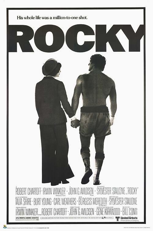
Some of the very best poster images are the very simplest. They not only manage to sum up a two hour movie in one image, but also create something that becomes iconic in pop culture. This is one of those. You have to cast your mind back to the original 1976 Rocky – before it was cheapened by countless bad sequels. Who would expect a boxing movie to be sold with such an elegant, even poetic image? There are so many interesting choices here…
Secondly, they chose to show the couple walking away from us. Since we can’t really see their faces, it forces us to examine their body language… Adrienne’s calm posture and look of adoring support and Rocky’s hulking gait and the punch-drunk tilt of his head. Most of all, it makes us focus on their tightly-gripped but gentle hand-holding at the very center of the picture, the unshakable connection between them. And it highlights the contrast in their appearance – her chaste pantsuit and goofy hat and his bloody/sweaty/dirty boxing trunks. Beauty and The Brute, if you will.
Finally, there’s that tagline which, again, underplays the drama and highlights the emotion instead. He’s not just lucky for getting a shot at the championship…he’s lucky for finding love. Even the contrast in typeset – his name in big block letters, but the tagline lower-case, with a period, not an exclamation point – reinforce that this is the story of a nobody who becomes a somebody. It’s really an amazing marriage of advertising and storytelling. Of course, the other poster they used – the famous shot of him raising his hands in the air after running up the museum steps, also seen from behind – is even more iconic. And is equally restrained, when you consider the kind of lurid boxing (even bloody) imagery they could have built a campaign around. This subtlety was probably a bit of a lucky accident. At the time, a boxing movie was considered incredibly passe (a year later the George C. Scott parody film, Movie Movie, would spoof 1930’s boxing movies). The studio’s advertising department would have been keenly aware of this perception and was likely trying to downplay the actual plot of the movie as much as possible…as well as get women into the theatre. But, no matter how pragmatic, they created great movie art in the process. Of the two classic posters, this one is my favorite.
|